By Nora Westgeest
In light of Wes Anderson’s newly released stop-motion animated film Isle of Dogs, this week, the TR’s Arts & Culture section will be entirely devoted to the American virtuoso. Our three-part series kick-starts with a piece considering the influences of the emblematic style that defines Anderson’s films. But keep your eyes peeled for the next two articles! Gabrielle Gonzales will be talking about the returning motif of dog casualties in Anderson’s work, and Geertje van Raak about Alexandre Desplat’s magnificent soundtracks.
Wes Anderson’s style is deemed by many to be iconic. The prototypical Andersonian elements, such as symmetrical shots, limited colour palates, panning, and hand-made miniatures (the latter making you feel like you’ve landed yourself in a human dollhouse) are quite easily recognised by those who’ve had the pleasure of viewing one of his movies. In addition to that, the most recurring theme is that of “coming of age” in a troublesome familial situation. Starting with his debut film Bottle Rocket in 1996 up to his latest release, Anderson has built quite a collection of these eccentric visual aesthetics and plotlines. Although iconic for the director, Anderson has in fact borrowed some of these elements from previous artworks, from the cinematic to the fine art, as well as from the cartoon world.
Firstly, let’s consider the theme of children acting like grown-ups, and adults in return acting like children. The highly intellectual speeches and remarks from the Tenenbaum children, or the adult-like relationship between Suzy and Sam in Moonrise Kingdom are but two examples. Critics and fans have noted this as a direct influence drawn from Charles Schultz’s comic strip Peanuts, in which children unconventionally talk about their feelings of sadness and even depression. This highlights the importance of the intellect of a child, and undermines the general conception that kids “are just kids”. The often-dry tone of speech in Anderson’s movies might also be linked to the popular comic strip.

A Charles Schultz’s Peanuts cartoon from May 5, 1984
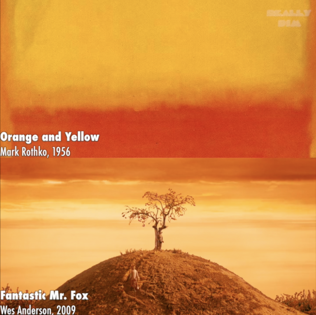
Another iconic Andersonian element is the particular colour palate. Anderson attributes each movie with its own specific palate, and he often uses tones that are out of the ordinary. Mustard and moss are defining for Fantastic Mr. Fox (2009), for example, and relate to the tonal shading in Mark Rothko’s paintings. Just like Rothko’s paintings, the colours draw you into the picture, making you momentarily forget about the world around you. It is the colour and its application that in itself provoke in us feelings of melancholy, happiness, or calmness.

A close-up of Mark Rothko’s painting Orange and Yellow (1956) and a still from Wes Anderson’s Fantastic Mr. Fox (2009)
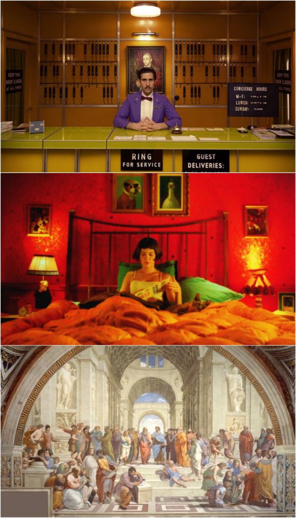
Use of line and symmetry is another element which is borrowed from the fine arts. If you’ve ever studied The School of Athens (1509-1511) by Raphael, you will know what I mean. The linear perspective is at its best in this painting, with a vanishing point – the central point around which the whole picture revolves – in the middle, pointing to the most important characters in the painting: Plato and Aristotle. Anderson’s shots are similarly filled with visual lines, which lead the eye across the screen and towards the most prominent subject. It is also not unlike some shots in Jean-Pierre Jeunet’s Amélie (2001).

From top to bottom: Still from Anderson’s The Grand Budapest Hotel (2014), still from Jean-Pierre Jeunet’s Amélie (2001) and Raphael’s The School of Athens (1509-1511)
Another element linked to the fine arts is Anderson’s inclination to use hand-made miniatures and two-dimensional dioramas, giving his films a theatrical element. Anderson blatantly draws attention to artificiality, related to the modernist and post-modernist emphasis on artifice, in contrast to nature. While we unmistakably realise that the resulting image is two-dimensional, and not a three-dimensional piece, this observation becomes complicated. It is said that the inclusion of full-length stop-motion films, such as Fantastic Mr. Fox and the newly released Isle of Dogs, is an indication that Anderson desires to become more and more engaged with the artificial realm through his films.
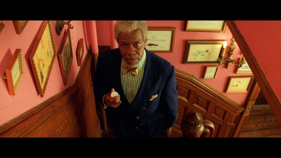
In an Anderson film, we quickly notice that every shot is meticulously planned, and every single gadget or crease is intentional. Not surprisingly, then, the objects in Anderson’s movies hold, in their entirety, a great deal of meaning. This is what critic Matt Seitz referred to as material synecdoche: “showcasing objects, locations, or articles of clothing that define whole personalities, relationships, or conflicts” (2009). Seitz mentions the comparison between the Wes Anderson’s work and J.D. Salinger’s The Cather in the Rye. He argues that both use interesting objects, especially regarding fashion choices, which define the work’s central character(s). According to Seitz, in Salinger’s novel, we get to know the protagonist as he reminisces over his brother’s catcher’s mitt, serving as a symbol for his emotional grappling with the reality of his brother’s death. Likewise, in The Royal Tenenbaums, fashion statements, such as Henry Sherman’s blue blazer and bow tie, relate to his conservative and controlled persona.

A still from The Royal Tenebaums: Henry Sherman’s blue blazer and bow tie
The last iconic element of Anderson’s films that I will mention is camera movement. Often, the Andersonian camera has a language of its own, with its large sequences of panning shots, tracking shots, symbolic slow motion, and overhead tableaux. We can very well assume that it is derived from the directors Jean-Luc Godard, Orson Welles, and François Truffaut, who are known favourites of Anderson. All three directors can be defined in the genre of the New Wave, distinguished by camera movements that break the barrier of the film’s continuity. This again relates back to the modernist and post-modernist idea of playing with artificiality.
Considering this, it is interesting to note that the New Wave was also marked by the technique that is called “la camera-stylo”, which relates to the idea of authorship. The “auteur theory”, as conceived by Truffaut himself, is the idea that the director is the creator of the film, who leaves his distinctive stylistic and thematic mark. Anderson can, in terms of his repetitive style and themes, definitely be regarded as a modern-day “auteur”. As a matter of fact, Anderson himself is very much aware of his cinematic ethos and the regularities of his cast, character development, style, and themes. With regards to his characters, Devin Orgeron even argues that they “promote (Anderson’s) own highly self-aware authorial image” (2007: 1). This would mean that Anderson portrays his authorial self through the depiction of his characters. Examples are the promotion of individual success stories, or a precise attention given to detail, as is the case with the crafting of pastries in The Grand Budapest Hotel. This idea of Anderson being in touch with his authorship on all levels of production is heightened when you consider that he writes a lot of the films’ script lines himself.
There are definitely other crossover references and intertextual markers to notice. We know, for example, that Wes Anderson was highly influenced by directors Martin Scorsese, Roman Polanski, Peter Bogdanovich, and Jean Renoir. But I hope this overview of an article has sparked an interest in some of you, if you’ve never heard of the guy before, or if you are not that much of a quintessential moviegoer. I am not that much of a film buff myself, but Wes Anderson serves as a definite exception. Even though he takes inspiration from other artists, Anderson adds a layer of value to these interpretations. By crafting films full of creative and original appeal Anderson establishes a special something that I can only refer to as his own distinct “aura”. A part of his unique spirit lines the edges of the screen like a watermark. It makes you believe that The Grand Budapest Hotel could not have been made by anyone else but him.
Nora Westgeest, class of 2018, is a Literature and Art History Major from the Brussels, Belgium.
Sources:
Orgeron, Devin. “La Camera-Crayola: Authorship Comes of Age in the Cinema of Wes Anderson” Cinema Journal 46.2 (2007): 40-65.
Seitz, Matt Zoller. “The Substance of Style, Pt. 4” 9 April 2009. movingimagesource.us.
Picture source: still from The Grand Budapest Hotel, taken from Justin Giglio (thefocuspill.com)

